

Sustainable Storytelling: Color Psychology & Climate Communication
A showcase of artists communicating about climate change
Climate has a communications problem. Art and storytelling are powerful climate solutions. This is designed to be an antidote for doom scrolling, brightening your inbox to provide climate education and soothe climate anxiety.
This week, we’re diving into color psychology and how color can help us communicate climate solutions more effectively.
Why Color Matters in Climate Communication
You may already know that color affects how we feel. In climate storytelling, it can also influence whether someone pays attention, shuts down, or feels empowered to take action.
Climate change is often shown through reds, oranges, and greys. These colors suggest fire, heat, urgency, and pollution. In contrast, the natural world is often represented with greens, blues, and yellows. These reflect plants, oceans, and sunshine.
Each color carries its own emotional tone in the context of the climate. For example:
Blue tends to evoke calm, safety, and trust. It often reminds us of the sky or water.
Red is associated with urgency or danger. It can bring to mind a fire alarm or a stop sign.
These emotional signals happen almost instantly, which makes color a powerful storytelling tool when used with intention.
Subverting Expectations with Color
One of my favorite strategies is using bright, playful colors to share complex messages. It helps create some distance from fear-based visuals and encourages curiosity instead of anxiety.
By softening the initial reaction, people are more likely to stay engaged with the topic. This helps build a sense of safety while still communicating urgency and makes space for people to take climate action.
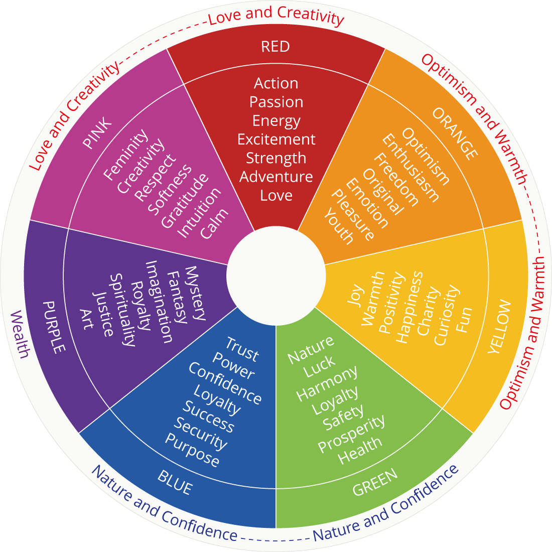
Artist Spotlight: Favianna Rodriguez
Favianna is an interdisciplinary artist whose work centers around joy and healing, while challenging entrenched myths and dominant cultural practices. She uses bold, joyful colors to share powerful messages about justice and environmental healing. From Favianna:
“These works reflect my own personal journey to realign with nature and to work towards a world where human beings can thrive and we can live in harmony with nature. We are in a time of climate chaos. The current extractive economy is not sustainable, it requires the exploitation of life - exploitation of humans, animals and earthly bodies like oceans and forests - for the benefit of a privileged few. We must move away from the world view of extraction towards one of partnership, as Indigenous people have been teaching us for centuries.”
Even in pieces that speak to climate chaos and systemic harm, her color choices offer a sense of calm, connection, and hope. See her work here.
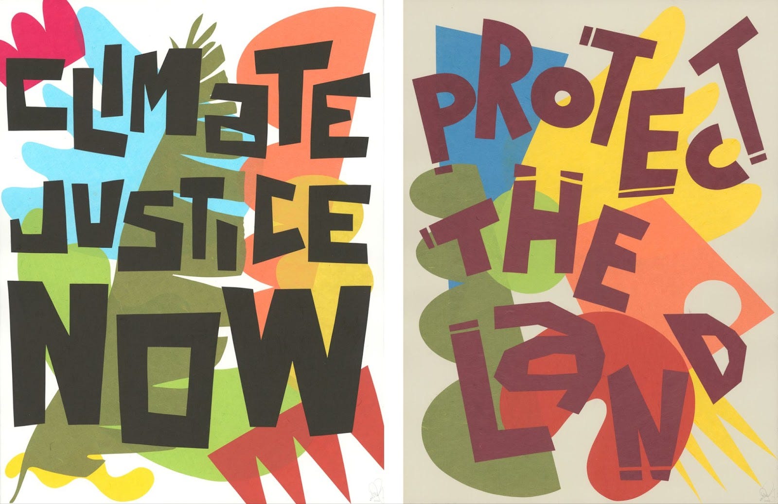
Climate Art 101 Student Spotlight: Charissa Meesriyong
Charissa created a series of paintings highlighting climate solutions using vibrant shapes and colors. One of her works shows wind turbines in a bright yellow landscape that feels full of light, energy, and optimism.
My next cohort of Climate Art 101 starts June 2. The early bird special ends in one week. If you want to get 50% off the course, you can learn more here. We do a deep dive into color psychology and learn other creative tools to help communicate about climate solutions.
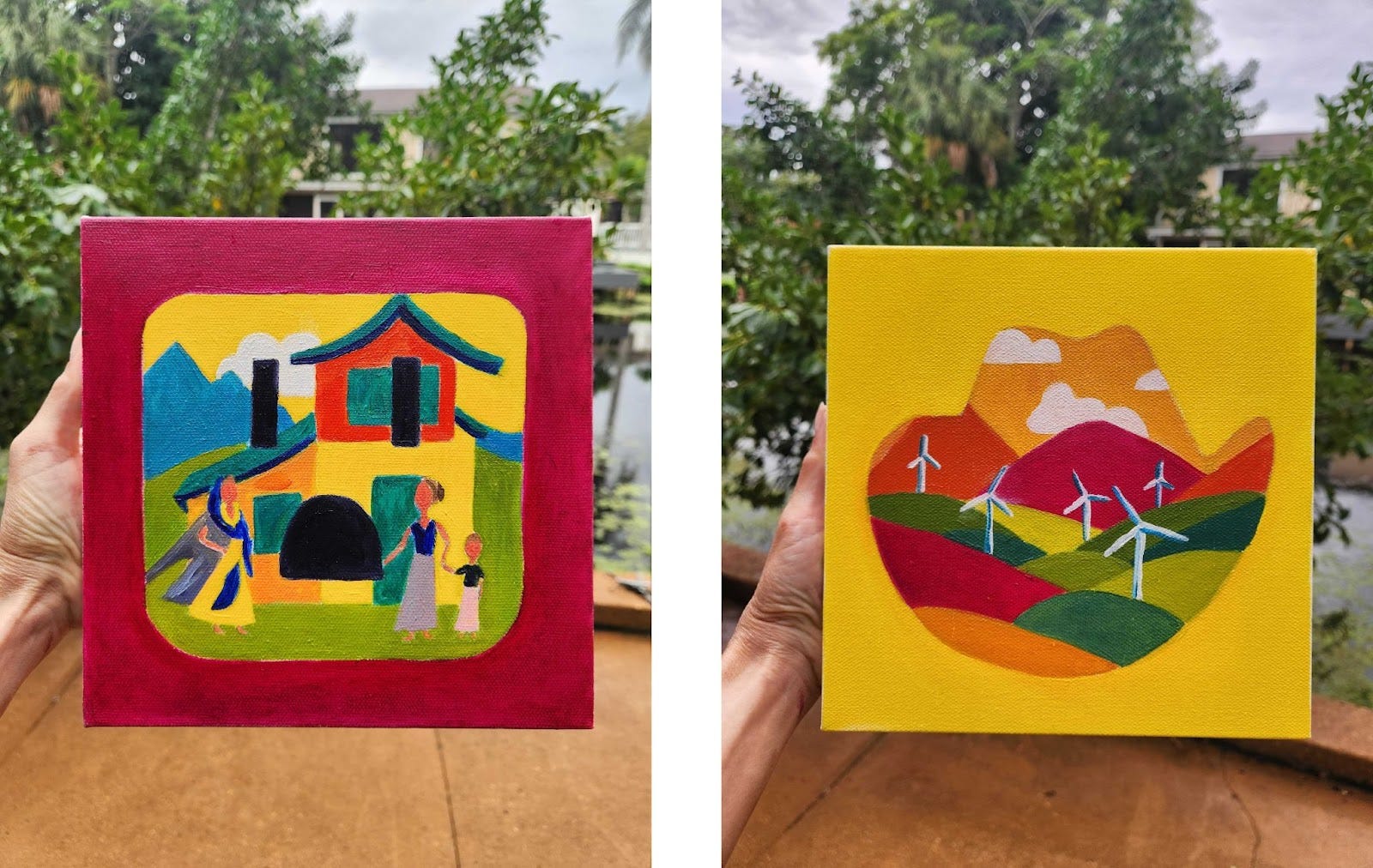
My Art: Color as Emotional Contrast
In my piece “Colors of Climate Change vs. Climate Solutions,” I focused on the emotional impact of different palettes. Without using words, you can imagine which color represents each solution.
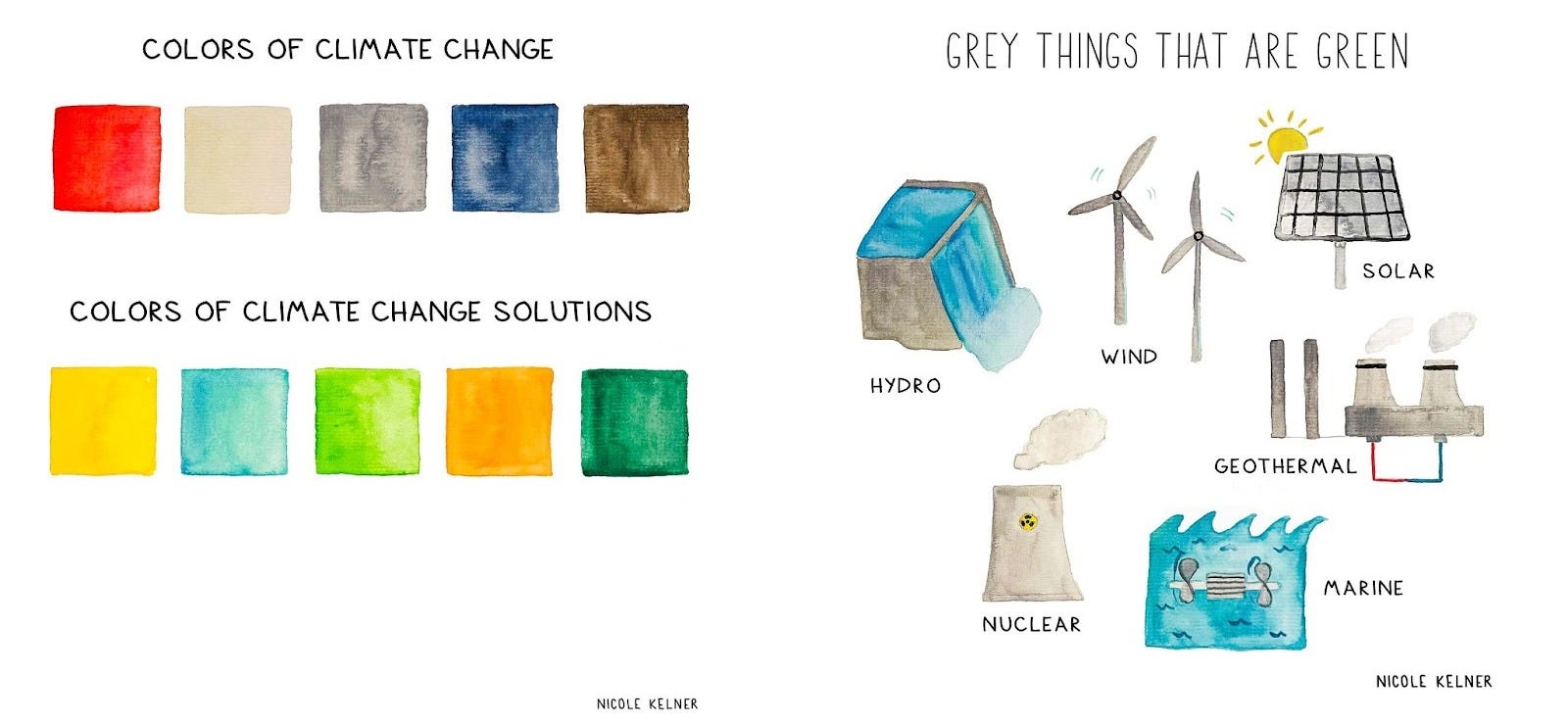
For “Grey Things That Are Green,” I used grey to reflect things like wind turbines and hydropower that don’t always grab attention at first glance. By adding accents of blue and yellow to show the context of these solutions in the real world, I was able to shift the tone and help these images feel more positive and solution-focused.
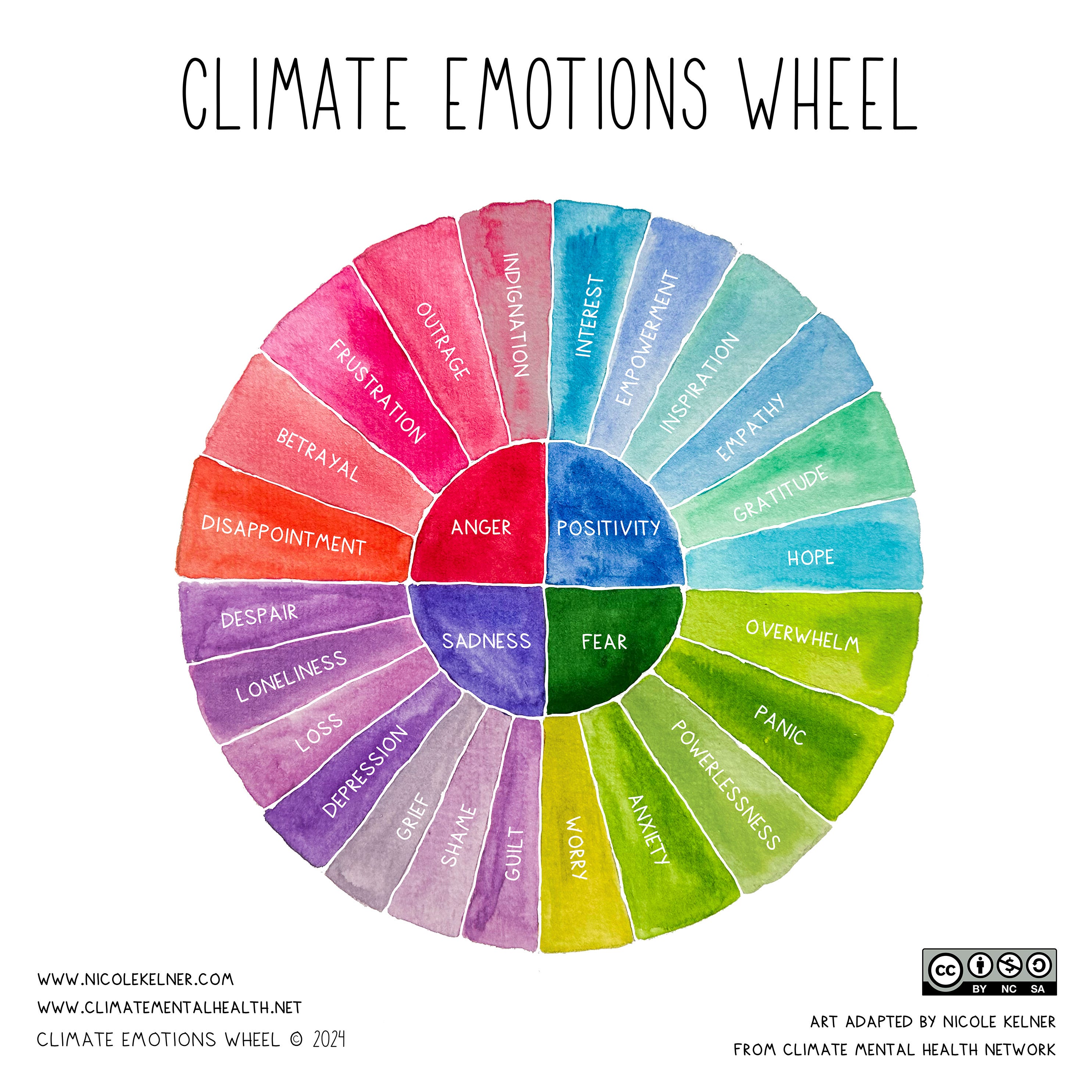
Here is another piece I adapted for the Climate Mental Health Network that helps people name their climate emotions. This is available for a free download here.
Lessons Learned
Color psychology is a way to subconsciously shape how people feel about climate change. Every brushstroke and hex code holds power.
There are moments when we need red to sound the alarm. And there are moments when we can use blues, yellows, or greens to offer a sense of optimism and possibility.
By choosing our colors with care, we can invite people not just to understand the climate crisis, but to imagine a world with climate solutions.
Upcoming Events
To celebrate Earth Month, I’m hosting a free, online climate workshop to make mini-zines about your favorite place in nature. You’ll learn how to turn your ideas into art and leave with your own little book.
If you don’t know what a mini-zine is, it’s a way of folding a single page of paper into 6 tiny pages. They are one of my favorite (and cutest) forms of art. April 24th at 1pm EST. Info here.

You’re jumpstarting my creativity, Nicole! So helpful while I’m thinking about colors for my new website. Thank you!
This is so great! I’m excited to discover your work.